Prefix
It is very common that we need a triangle caret on a web page to display as an arrow or other similar symbols. It can be achieved by using a png or svg file, or importing from third-party icon library such as Font Awesome
However, a more efficient low-carbon way is to draw it using CSS border attribute.
A normal border
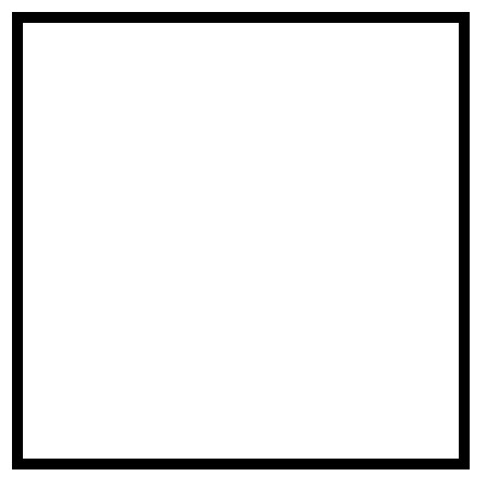
The most common use case of a border would be this:
<div class="box"></div>

<style>
  .box {
    height: 100px;
    width: 100px;
    border: 5px solid #000;
  }
</style>
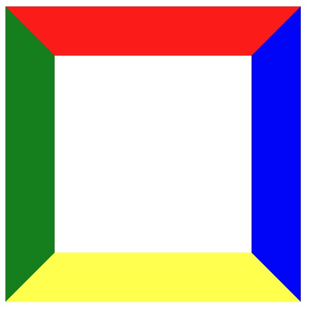
If we take a look at the border shape by giving a wider width of it, we will see it looks like this:
<div class="box"></div>

<style>
  .box {
    width: 200px;
    height: 200px;
    border-color: red blue yellow green;
    border-style: solid;
    border-width: 50px 50px 50px 50px;
  }
</style>
Border with zero height and width
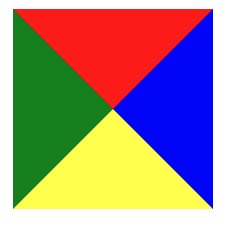
Instead of giving height and width to the box, when we set the width and height of the outer box to 0, the width of the border will stretch out the outer box, four sides of the borders will collapse together and each side of the border will be a triangle of 100px wide and 50px height, just like this:
<div class="box"></div>

<style>
  .box {
    width: 0;
    height: 0;
    border-color: red blue yellow green;
    border-style: solid;
    border-width: 50px 50px 50px 50px;
  }
</style>
Display as a triangle
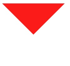
Now what we need to do is to hide three other sides of the border and only show one of it:
<div class="box"></div>

<style>
  .box {
    width: 0;
    height: 0;
    border-color: red transparent transparent transparent;
    border-style: solid;
    border-width: 50px 50px 50px 50px;
  }
</style>
#Other cases
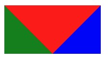
If we try to set one side of the border width to be zero, we’ll get and rectangle with three triangles:
<div class="box"></div>

<style>
  .box {
    width: 0;
    height: 0;
    border-color: red blue yellow green;
    border-style: solid;
    border-width: 50px 50px 0 50px;
  }
</style>
Use cases
This can be useful if we need a ribbon icon on page just like this:

The solution is to draw a rectangle on top and add a sudo class :after below it to implement 3 sides of the border:
<div class="box"></div>

<style>
  .box {
    width: 50px;
    height: 70px;
    background: red;
    position: relative;
  }

  .box:after {
    position: absolute;
    left: 0;
    top: 70px;
    content: '';
    border-width: 12px 25px;
    border-style: solid;
    border-color: green green transparent green;
  }
</style>
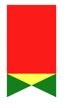
And we just need to set the color all red, and maybe add some text to make it a perfect ribbon.
